Banner Design Tips for Your Online Jewelry Business
by Sue Runyon
A banner, in website design, is often a 100 x 760 pixel sized image that goes across the top of web pages. Other sizes are used for blogs or other applications.
Your banner is extremely important because it sets the stage for the entire website and your image as an artist.
It’s the first impression that invites people to stay or makes them want to leave your site.
When I first started my website I used a stock banner that had no information on it that was unique to my shop.
I eventually figured out how to customize that with my business name and tag line, but it was still just a stock banner.
I needed to come up with my own personal banner that was unique to me. This is the story of that process and the “before” and “after” shots to impress upon you how thorough the transformation has been.
I wish I had done it sooner. I’m very excited about the results.
My Sad Attempt #1
I thought that a photo banner might be the way to go and I didn’t think it was too bad, but clearly not professional.
The only tool I have on hand is an ancient version of CorelDraw that doesn’t even support .jpg files! It worked for a while until I changed my tag line and color scheme.
My Sad Attempt #2
So, I tried another photo banner, but it just didn’t work well with my website design. It looked clumsy and dull and I couldn’t get the spacing or font right.
I began to think a photo banner might draw attention away from larger photos of items currently on sale in my shop.
It took entirely too much time for unsatisfactory results.
My Sad Attempt #3
As I began to work out the design and color scheme for the rest of my website, I needed to change the banner quickly to go with it, so I took five minutes to make the one above.
It incorporates a small pearl flower photo that I love and use as an “avatar” or profile picture for Sue Runyon Designs, but the overall design was boring!
Finding a Professional Banner Artist
What I really needed were graphics that would set the mood for my online store, Etsy.com store, my blog, my Facebook business page and elsewhere to give me a consistent look for my brand.
Calling in someone who really knew what they were doing became a priority.
I did a search for custom graphics on Etsy.com. I looked through many pages of search results several times and kept coming back to the same artist whose design sensibilities seemed to mesh with my wishes.
I chose Neil from Oceanfront Studio.
I checked his feedback to make sure he had lots of satisfied customers and then purchased a custom graphics package.
Neil sent me a long list of questions to answer. I won’t give away his trade secrets, but he is very thorough and thinks through every aspect.
That’s one of the reasons I chose him over other designers based on his feedback. Communication is key to getting a good finished product.
Design Elements I Wanted
in My Banner
The main thing I wanted was something with an ASIAN feel, but without rampant dragons and Chinese restaurant script fonts.
I learned to string pearls and buy pearls and jade while living in Asia so I wanted an Asian feel to the graphics for my jewelry shop.
I also wanted to use a ROBIN’S EGG BLUE, SOFT GREENS and WARM ACCENTS to reflect the type of colors I use in my photo backdrops for a cohesive look.
But mostly, I wanted something that was personal and uniquely mine.
What I Sent to Neil
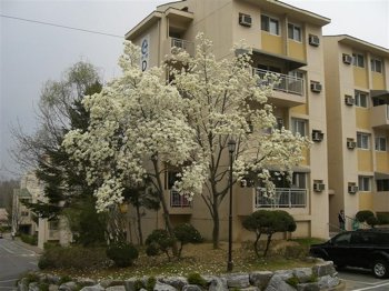
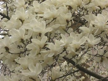
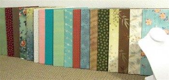
After some consultation, I ended up sending Neil the picture below showing my photo backdrops and some photos of Asian magnolias that I took by our apartment building while living in South Korea.
Asian magnolias are not evergreen like American magnolias so they are covered in flowers in spring before they put out leaves. They were always so graceful and beautiful.
Asian magnolias outside our apartment building in South Korea:
Photo backdrops I use:
I also provided Neil with some key characteristic words: FRESH, PRETTY, NATURAL.
What Neil Sent to Me
And sooner than I expected, he came back to me with these wonderful graphics which incorporate everything that I wanted.
“Thank you” graphic. I also have one for custom orders and one for reserved items to use in my Etsy.com store:
My new banner! I also have one to use when I am on vacation and another for when I’m having a sale:
He also designed other graphics such as a blog banner and ad for me.
So, after working with Neil at Oceanfront Studio, I now have the uniquely personal graphics package that I wanted.
I love how it has a glow and looks as if you could walk right into it. I enjoy the robin’s egg blue Asian design in the background that continues the floral theme.
In addition, as a complete surprise to me, he designed everything to match the little pearl flower avatar that I use.
I think he did a fantastic job. Best of all, my various online venues now have a cohesive look.
And I was truly surprised at how reasonable prices for these graphics are.
“Bounce rate” in web terms refers to when someone visits one page of your site and then leaves without visiting any others. Since beginning to use my new graphics, my “bounce” rate has decreased!
Author Sue Runyon of Sue Runyon Designs is a jewelry designer working in freshwater pearls and gemstone beads. She uses classic construction techniques such as hand-knotting for beautiful drape and durability.
You can also find Sue online at these locations:


