
Honeysuckle Spring – Your Honest Input, Please
by Dianne Culbertson.
(Waterville, Maine USA)
I like the composition but am having a hard time with the colors. Does it work or should I start over?
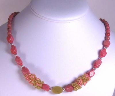
OK so I don’t like the color pink much and when I heard that Honeysuckle is this year’s top fashion color I cringed.
I’m a Fall person so I like the earthy colors and find it very easy to design in those colors. I can stretch my abilities to oranges and even peachy hues but when it comes to pink I run.
Well, this year I could escape no longer and I would like some honest input.
I have corkboards all around the studio with all my gems and pearls so I can see them. They are all separated by color and the “Pink Board” has been there for 6 years!
On it I had some Rhodonite in a variety of shapes and sizes so began with that.
I decided to add some green for Spring and the “New Jade” jumped out. I would have liked to incorporate more of that into the neck but only had a few pieces left and I have to make 2 for this shop I am designing for.
I added a few sterling beads and this is what I came up with. I like the composition but am having a hard time with the colors.
Tell me, does it work or should I start over?
Dianne Culbertson
Comments for
Honeysuckle Spring – Your Honest Input, Please
Honeysuckle Spring
by: Rena
Hi Dianne,
I’m not the world’s best bead necklace designer – so please don’t take my thoughts here as gospel! :o)
I pulled your Honeysuckle Spring necklace photo up on my computer screen, and then stood back about 7 or 8 feet to get a different impression of it.
I thought it could possibly use the “punch” of a dark color – such as black, hematite, dark brown, dark green, or…?
Like you, I’m not a “pink” person and I have a hard time designing with it – but I do like the complimentary color scheme of pink and green.
I’m interested to hear what our other friends here have to say!
I like it 🙂
by: Helen UK
I’m not generally a ‘pink’ person either but I really like this, it’s a gorgeous shade of pink and I love the design x
leave it as is
by: pat barden
the colors are great–especially the way you have them–not much of the green–and the way youve worked it in–slowly–and not much of it.
iffing it were hot pink and kelly green–yikes–but, man–youve picked shades of the pink and the green that are a fetching match
Many Thanks
by: Dianne
Thanks so much for your comments, I really appreciate you taking the time to respond.
I Like Pink
by: Maryanne Murphy
….and this is a really really honest assessment of your necklace…In my opinion which is only 1 person.
The color is GREAT
The selection of the two style beads is GREAT
Silver separators GREAT
The middle bead looks brown, not great
Whatever is to the left and right of middle bead. not great.
There’s nothing wrong making a necklace in entirely one color and honeysuckle is the 2011 Pantone color pf the year. Ladies wear a lot of print dresses. I have one that your necklace would go perfect with. I would remake the necklace using silver spacers in creative and strategic ways.
I have a necklace on my bead board right now that has to be made over.
Maryanne
www.ontherocksgems.com
20% of purchases are donated
Honeysuckle necklace
by: Victoria Rickert
It is a very pretty necklace and lots of women love pink! The only suggestion I can give is to only use the green bead in the center and move the other two pinks to the outside of the beaded design. It then makes the green the focal point. Food or beads for thought.
Not a Pink Person Either, But…
by: Carol Bradley
I see a problem with the greens that you have chosen. The values (lightness vs. darkness) of the pink and green beads are very close. The center bead looks opaque which would further make it blend in with the pinks.
A general guide that quilters use is helpful for beaders too. They chose dark, medium and light shades to get good contrast in the design. I think a clear light yellow-green or a darker pink would make the pink beads “pop” more.
Here’s a little more about color values > http://www.quiltuniversity.com/contrast_and_value.htm .
Many Thanks!
by: Dianne Culbertson
Many thanks for all the helpful comments, ideas and suggestions!
First off, I like the necklace!
by: KipperCat
…but since you asked us to look at it for changes I have. I think the beaded beads could be placed a bit differently. You might try them on either side of the center green bead, so that the three together make more of a focal. Or you could move them a bit more to the side, with perhaps two large rhodonite beads between the green jade and the beaded beads.
The other change I’d like to see is a bit more green. Perhaps a green sz 8 or 6 seed bead, or a small glass druk. You could try these on either size of the silver beads where you now have the small pink beads. Come to think of it, perhaps more of the lighter pink used in your beaded beadwould accomplish the same thing.
Now that I’ve read the others’ comments, I have to agree that a slightly darker green in the center bead would be more of a focal. It’s hard to be sure on a photograph. Even though your necklace is gemstones, I think a few glass beads would be acceptable.
still, isay–leave it be
by: pat barden
ijust wanto toss in agane–leave it be–as i said before–but after reading all theze–ineed to repeat, repetively–leave it.
ithink the shades of the pink and the green is a fetching match–like icky and sweet–perfect–they play off each other–ithink the sizes and space–it all flows–
ithink its a great necklace to match with a spring knit scoop neck shell, a cooton v-neck t-shirt–and even a fluidy pale silk button-down witha collar
Leave it alone
by: SusieK
Leave it be, looks great the way it is and I like the color combo. Great for spring.
Sold!
by: Dianne Culbertson
I have now sold the 2 of these that I had already made as pictured so I guess they were not too bad. I do like some of the suggestions, thanks so much for your input EVERYONE! I just love that I can get some real, constructive and kind criticism on this site. You are all great, thanks again, so very much!
Just my opinion
by: Christee
I am a pink person. My favorite saying “Pink is more than a color. It’s an Attitude!”
The only thing that I think I would change on this necklace is the placement of the seed beads. I think that if you moved them at least one section away from the center bead. I feel like your eye would flow over the entire necklace instead of being drawn only to the center.
But I think it is great!
great news!
by: Anonymous
I’m glad to hear it. It was a fun exercise, anyway.
its nice the way it is,,but….
by: Dody
not a pink person but I love this combo, however I would take out the center bead and add a beaded bead dangle or pendant in the center, to tie it all together. it’s lovely as it is, the brownish bead just throws it off without any other bead in it of the same color.
re;
by: Lestyn
Hi,
Even though you are not sold on the colors doesn’t mean there isn’t someone out there, that loves the colors.
So when I make something I think is awful. There is always someone that will think differently. Colors that I like are turquoise, pinks, purples, lime. Ones I hate are peaches, browns, etc. But there will be a customer that will love this combination. Go for it!
You don’t have to wear it. LOLO
Customers love my horrible color combos!
by: Rena
Lestyn, your post reminds me that time and time again, my ugliest and most embarrassingly horrible color schemes tend to get snatched up and bought first!
I can almost bet that the piece I hesitate to put out in my display because of the ugly color scheme will be the one that the first person to walk by will exclaim, “Oh, I love this!” 🙂
Just goes to show…
by: Melody
Many interesting comments, although some people didn’t notice that Dianne said she was happy with the composition – just worried about the colour. I, too, am not a ‘pink’ person and I also cringed when it was decided by Pantone to be this year’s colour. But not everyone will be wanting to buy this colour, anyway – especially we non-pink people!
I think this exercise goes to show that as jewellery designers, we are all still individuals and have our own preferences, which will be echoed by the buying population. As mentioned above, what one person hates, another will love, and there will always be someone who buys something we really don’t like ourselves. I congratulate you on selling these pieces, Dianne, which puts an end to your worry about this!
love the beaded beads
by: Carol
Love the green witht the pink. It keeps it from being “sweet”. I’m not usually a fan of pink either but something about spring…the only change I would make is to incoporate more of the beaded beads as they really soften the piece. But maybe you don’t want to do that? In any rate, if we all liked the same thing that wouldn’d be much fun, would it?
Leave it…
by: Robyn
I think its great, and one thing to remember might be that even if you don’t love it, someone else probably will! Often the items i sell the most of are the ones i wouldn’t wear myself. I’m not really a pink girl either, but so many people love pink, and will see something different in the necklace to what you see when you think of wearing it yourself.
My two cents’ worth — accent!
by: Margaret
I’m not a fan of turquoise, so last year I struggled, nor am I a fan of “honeysuckle” pink, so here we go again. It finally came to me, though, that people don’t necessarily want their jewelry to be the exact same color as their clothing. Accents and highlights are nice. For example, a necklace featuring white pearls would be beautiful on a honeysuckle blouse, plus are timeless and very versatile — in other words, a “wise” jewelry investment. Also, check the Pantone predictions for other colors besides the “color of the year”. See what colors they’re predicting will be paired with the color of the year. You may be more comfortable playing with some of those. Or, try using just a bit of the “color of the year” as an accent in an otherwise neutral (white pearls or black, for instance) jewelry palette. Then follow your instinct. And if you’re in the market for turquoise colored beads, I notice there seem to be an awful lot of them being destashed!
Honeysuckle Spring
by: Sue Hahn
I love the colour mix, but not the central bead. How about another design using 3 of the beaded beads, the third replacing the central bead.
Here’s my 2 cents
by: playsculptlive
I cringed as well thinking that the color this year would be pink. But, I love brown with pink. On my screen your green beads look more like amber. anyway, try brown beads instead of the silver, it’ll pick up the pinks and greens very well. If you do mixed-media, using wood beads make the necklace very accessible.
there it is, my 2 cents.
It was clearly a good piece – SOLD!
by: Pam
I’m not much of a “pink” person either, but since we will have customers whose color preferences differ from our own, I think it’s always good to have a varied palette. I like the green with the pink, it’s a nice “spring” mix, as a garden would have just these colors.
So glad to hear you have already sold this piece – I’d make another since it sold quickly!
Super close-tone colours!
by: Maureen
Leave it as it is, Diane! The close-toned colours are delightful. Give it a chance to live as you have made it originally, and in a few months’ time, if no-one has snapped it up, you can de-construct it and try something else.
Best of Wishes to you
Maureen Crisp
England
